Logo numerology reads three things: the letters actually drawn in the mark, converted by the Chaldean values into a compound number; the colours, matched to a planet; and the shape. The first is where the real finding usually sits. The total of the letters in your logo is often not the total of your registered name, because a logo drops words the registration keeps.
None of this predicts how a mark will perform, and much of what circulates under this heading is decoration rather than method. The closing sections separate the part worth using from the part worth ignoring.
What logo numerology actually reads
A logo is not one object to this system. It is four, read separately.
| Layer | What is counted | How much the tradition says |
|---|---|---|
| The wordmark | The letters as drawn, converted in Chaldean and totalled | The great majority — this is where the method is detailed |
| The element count | Discrete parts of the mark: strokes, bars, leaves, star points | Moderate, and mostly inference |
| Colour | The dominant colour matched to a planet, and so to a number | Moderate, inconsistent between schools |
| Shape | Circle, square, triangle; open or closed form | Light, and largely modern |
Weight your attention accordingly. The letter arithmetic comes from the source material and can be checked by anyone. The shape associations are where practitioners fill gaps with their own reasoning. The Chaldean values the calculation rests on:
| Value | Letters |
|---|---|
| 1 | A, I, J, Q, Y |
| 2 | B, K, R |
| 3 | C, G, L, S |
| 4 | D, M, T |
| 5 | E, H, N, X |
| 6 | U, V, W |
| 7 | O, Z |
| 8 | F, P |
There is no 9: no letter carries it, though totals land on 9 constantly. The methodology page covers why the site treats Chaldean as primary and Pythagorean as the comparison.
Counting a logo: what goes in the total and what does not
This is where most readings go wrong, so it is worth being strict.
Count the letters that are drawn. If the mark on the van says NORTHBEAM and the certificate of incorporation says Northbeam Timber Limited, the mark is a different string and produces a different number. Read what customers see.
Do not count the entity suffix. Ltd, Pvt Ltd, LLP, Inc, GmbH and their relatives are conferred by a registrar. They are administrative, not chosen, and the tradition does not count them. Including LTD adds 3 + 4 + 4 = 11, and because 11 is not a multiple of 9 it shifts the reduced digit by two every time.
Treat the monogram as its own mark. An app icon or an embroidered patch showing two letters is a separate string with its own total, and often the version customers see most.
Ambiguities the schools disagree on. A stylised ampersand: some count it as AND, some ignore it. A dot in a domain-style mark: usually ignored. Numerals: face value. Accents: the base letter. Nobody has authority to settle these, and anyone who says their handling is correct is overstating the position.
Worked example: scoring a logo from scratch
An invented timber-frame firm, registered as Northbeam Timber Limited. The founder was born 12 June 1979. The mark reads NORTHBEAM TIMBER with an icon of four stacked beams, printed in dark green.
Step one: the wordmark
| Letter | N | O | R | T | H | B | E | A | M |
|---|---|---|---|---|---|---|---|---|---|
| Value | 5 | 7 | 2 | 4 | 5 | 2 | 5 | 1 | 4 |
5 + 7 + 2 + 4 + 5 + 2 + 5 + 1 + 4 = 35, and 3 + 5 = 8. NORTHBEAM alone is 35/8.
| Letter | T | I | M | B | E | R |
|---|---|---|---|---|---|---|
| Value | 4 | 1 | 4 | 2 | 5 | 2 |
4 + 1 + 4 + 2 + 5 + 2 = 18, and 1 + 8 = 9. TIMBER alone is 18/9.
Together: 35 + 18 = 53, and 5 + 3 = 8. The full wordmark is 53/8.
Two things fall out of that. The descriptor did not change the reduced digit — 35 and 53 both come to 8 — but it did change the compound, and the compound carries the reading. Report it as 53/8, never plain 8. Second, counted with the suffix, LTD adds 11, giving 64 and a reduced digit of 1: a different reading produced by a mistake, and the commonest error in amateur analysis. Swap "Co" for "Limited" and 53 + 10 = 63, reducing to 9: a two-letter word moves the mark from Saturn to Mars.
Step two: the monogram
The app icon shows NB. N = 5, B = 2, total 7 — Ketu, the number the tradition attaches to research and specialism, a long way from the 8 of the full wordmark. Most customers now see a company's monogram far more often than its full mark, on a phone screen, and the monogram is a different number. If you take this method seriously, take it seriously for the version with the most impressions.
Step three: the founder's numbers
Driver: the day is 12, and 1 + 2 = 3, reported 12/3, Jupiter. Conductor: 1 + 2 + 0 + 6 + 1 + 9 + 7 + 9 = 35, and 3 + 5 = 8. Conductor 35/8, Saturn.
The conductor is 35/8 and the wordmark 53/8. The digits agree: a slow, land-and-property number on a timber-frame firm run by a person whose working-life number is the same. But the founder–business check reads it only as Workable, 57 — a name on the founder's own conductor is a strong alignment, then 8 is marked down as a trading-name total and sits neutral to the driver of 3. The example was built to look neat, and even so the arithmetic is messier than the digits suggest.
The tension is with the driver. Jupiter wants yellow and gold; Saturn wants dark blue and deep brown; the mark is dark green, which belongs to Mercury. Three numbers, three colour claims, resolved next.
Step four: the element count
Four stacked beams. Four is Rahu — technology and the unseen — which sits oddly on a timber business but is not read as harmful. Dropping to three beams would put the icon on Jupiter and match the founder's driver, at a cost of an hour of design time before launch.
Compare changing the registered name: filings, signage, stationery, livery, domains, search rankings and recognition. When this method suggests a change, the honest question is what it costs against what it is claimed to buy. Element counts are cheap; names are not. The guide to choosing a business name covers the expensive end of that trade-off.
Colour in logo numerology: the planet map
Each number carries a planet and each planet a colour family — the part of the method quoted most and examined least.
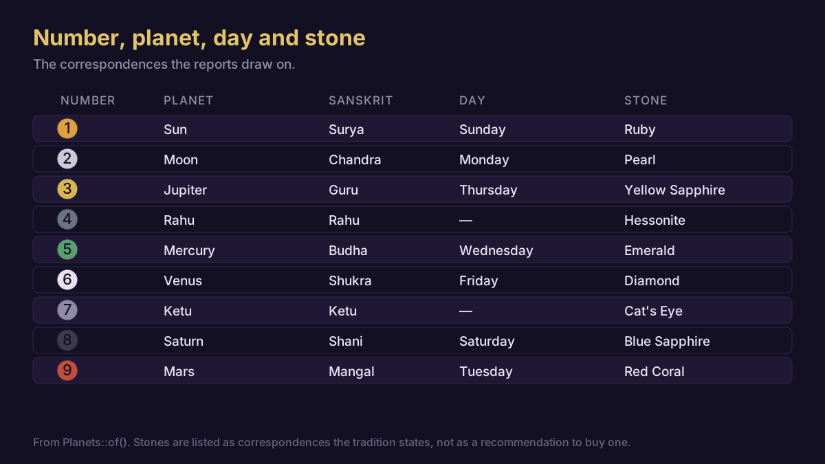
| Number | Planet | Colours the tradition assigns | Sector where the pairing is conventional anyway |
|---|---|---|---|
| 1 | Sun | Gold, amber, deep yellow, orange | Founder-led firms, authority brands |
| 2 | Moon | White, cream, pale silver, palest green | Care, service, partnership, wellbeing |
| 3 | Jupiter | Yellow, saffron, gold | Education, publishing, advisory |
| 4 | Rahu | Grey, blue-grey, electric blue, iridescent mixes | Technology, data, infrastructure |
| 5 | Mercury | Green, turquoise, bright light tones | Retail, media, broking, logistics |
| 6 | Venus | White, pastel pink, pale blue, silver | Hospitality, beauty, interiors, fashion |
| 7 | Ketu | Smoke grey, muted mixed tones, sea green | Research, consultancy, niche craft |
| 8 | Saturn | Dark blue, black, charcoal, deep brown | Property, land, heavy industry, law |
| 9 | Mars | Red, coral, deep orange | Engineering, groundworks, sport, metal |
Read the right-hand column carefully, because it is the honest part of the table. The colour associations line up with sector conventions that exist for separate reasons. Where the map agrees with convention it adds nothing; where it disagrees, convention is the safer bet, because customers have been trained on it and have never heard of the map.
The map also contradicts itself: the Sun and Mars both claim red in most listings, and where they are separated the split differs by source. An unresolved overlap on the two most visible colours is a reason to hold the map loosely.
For Northbeam, the ordinary resolution is to build the palette on the business's own number — the mark represents the business, not the founder — and allow the founder's colour as an accent: charcoal and deep brown, with warm ochre for the Jupiter driver. That is a reasonable palette for a timber-frame builder for reasons unrelated to planets.
Practitioners disagree here. Some colour for the founder throughout, on the argument that a small firm is the founder; some for the trading name total; some for the sector. There is no settled answer, and a reading that presents one without acknowledging the others is not reporting the tradition faithfully.
Shapes and what the tradition attaches to them
| Shape | Number it is usually given | Traditional read | What it does in practice |
|---|---|---|---|
| Circle | 1, or 6 for the softer reading | Wholeness, containment, community | Friendly, scales well, a crowded category |
| Square | 4 and 8 | Ground, structure, patience | Solid and corporate; can read static |
| Upward triangle | 9, sometimes 3 | Ascent, force, aspiration | Directional; corners vanish at small sizes |
| Horizontal rectangle | 8 | Steadiness and breadth | The most practical container for a lockup |
| Open form | Read as a leak | Discouraged for anything handling money | Modern and airy; no practical downside |
Only the last column has a defensible mechanism behind it, and it is not a numerological one: simple closed shapes with few elements survive reduction, reversal and single-colour printing, and complicated ones do not. Where the tradition pushes towards a plain circle, square or triangle, it reaches good practice by a route unrelated to why the practice is good.
Element counts: how many things are in the mark
Total the discrete parts of the icon and reduce. Three chevrons is a 3, five leaves a 5, a seven-pointed star a 7. Where the count is ambiguous — a line that crosses itself, a gradient mesh — the method has nothing to say, and practitioners either impose a count or quietly move on. That is a genuine boundary of the technique. The useful side effect is that counting forces you to notice how many things are in your mark, and the answer for a weak logo is usually "too many".
Where logo numerology and brand design agree
Keep this section if you keep nothing else.
Reproduction beats symbolism. Your mark has to work as a favicon, in a single embroidery thread, reversed out of a dark background, and at three metres on a van. A palette chosen for planetary meaning that collapses to unreadable grey in one-colour print has failed at the only job it had.
Contrast is not negotiable. A pale yellow wordmark on white is unreadable whatever Jupiter is said to want. If the map points at a light tone, put it on an accent and keep the wordmark legible.
Roughly one man in twelve has a red-green colour deficiency. A mark whose meaning depends on telling red from green loses it for a slice of your customers, which outranks every association in the table above.
The number is not the asset. Recognition is. A mark accrues value by being seen repeatedly and unchanged, which is why established firms change their marks so cautiously.
Nothing here is a trademark search. A number says nothing about whether a mark is registrable or already taken. Run the name analyser on a shortlist by all means, then check availability properly, including the domain.
When the numbers say recolour a logo that already works
Usually: do not.
The arithmetic that matters here is commercial rather than numerological. A full identity change on an established small business means new signage, livery, packaging, uniforms, print, stationery and app store listings, plus the design fee and a period when some customers cannot find you — four figures at the very bottom end, five figures ordinarily. Against that, the method offers no mechanism and no measurable benefit. The sensible order:
- Before launch, when the mark is a file and nothing else exists — this is where the whole method belongs. Changing a beam count or a shade costs an hour.
- At a rebrand you were already doing — fold the numbers in as one input among many.
- On a working, recognised mark — leave it alone. If the number troubles you, the cheap moves are an accent colour, a secondary palette, or a monogram whose letters total differently. The best name numbers for business piece applies the same restraint to names.
Frequently asked questions
How do I calculate my logo's number?
Take the letters as drawn, convert each with the Chaldean values, add them, then reduce to a single digit while keeping the compound. NORTHBEAM is 5 + 7 + 2 + 4 + 5 + 2 + 5 + 1 + 4 = 35, reducing to 8, so it is reported as 35/8. Leave out Ltd, Inc and any other registrar suffix, and total a monogram separately.
Does the logo number have to match the company name number?
They often differ, because a logo drops words a registration keeps. The tradition treats the registered trading name as the primary number and the mark as a secondary reading of what customers see. If the two disagree badly, the usual advice is to bring the mark closer to the name rather than re-register: that is the cheaper direction.
What is the lucky colour for my business according to numerology?
Colour follows the number's planet: gold for 1, white for 2, yellow for 3, blue-grey for 4, green for 5, pastels for 6, muted greys for 7, dark blue and charcoal for 8, red for 9. Treat it as a starting palette, not a rule — legibility, single-colour reproduction and your sector's conventions all outrank it.
Is a circle or a square better for a business logo?
The tradition gives the circle to the Sun and reads it as whole and communal; the square goes to Saturn and Rahu and reads as grounded and slow. Neither is better. Both reproduce well at small sizes, the property that actually matters, and both are heavily used, so distinctiveness in your own sector should decide it.
Can changing my logo change my business's fortunes?
No claim of that kind can be supported, and this site does not make one. A logo change does affect recognition, which is a real commercial variable, and usually affects it negatively in the short term. Use this method to choose between options you are already happy with, not as a reason to change what is working.
Where this runs out
The letter arithmetic is the only fully checkable part of this. Anyone with the value table can total a wordmark and get the same answer you did, which is why it is worth showing the working. Everything past the letters is softer, in a specific order: element counts are inference, colour is inconsistent between schools, shape is largely modern invention dressed in old language.
There is no evidence that a logo totalling 53/8 performs differently from one totalling 47/2. No study has tested it, and the examples usually offered — successful companies whose marks happen to total favourably — are selected after the fact from the survivors. Every failed firm with the same total is missing from the list.
The method is silent on nearly everything that determines whether a mark works: whether the logo is legible at 16 pixels, whether it looks like a competitor's, whether it is registrable, whether the person who drew it is any good. Those questions decide the outcome; the number does not. Practitioners also disagree on the points you would most want settled — colour for the founder or the business, whether an ampersand counts, whether a monogram outranks a wordmark. Where a field disagrees this openly, treat a confident single answer as a warning about the person giving it.
What is left is modest and real. Running the numbers on a shortlist forces a structured look at a decision founders often make in an afternoon on instinct. It makes you count the elements, notice that the app icon is a different string from the sign, and check the palette against something other than personal taste. Treat the output as a prompt for reflection and planning, keep design fundamentals in charge, and this stays a useful discipline rather than an expensive superstition.